New Strategy and Look for SCADALink (Bentek Systems Ltd.)
Corporate Identity
Bentek Systems Ltd. has expanded its portfolio to include other applications.
It is time for a makeover and integrate all the branches for a fresh and clean visualization.
------- Method of Branding and Rebranding Strategy -------
Throughout the time, a popular line of product, SCADALink, has been more popular than the brand house, Bentek Systems Ltd.
Instead of Bentek Systems Ltd. as a major brand, we will move up SCADALink as a main brand. Bentek Systems Ltd. will remain as a sub-brand for system development, client support and service, as well as other internal company services.
SCADALink will rebrand as SCADALink Corporation. Other line of products such as SatSCADA, PumpMate and Remote Monitoring will rebrand as sub-brands within the SCADALink Corporation. E.g. SCADALink SatSCADA, SCADALink PumpMate, SCADALink Remote Monitoring… This branding method will help us to combine all the sub-brands and keep the firm recognizable.

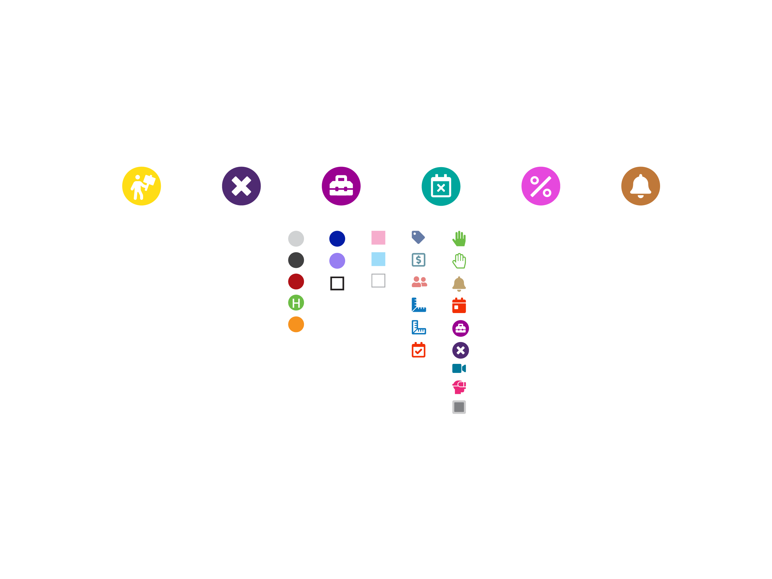
------- Color Theory -------
------- Logo Design -------
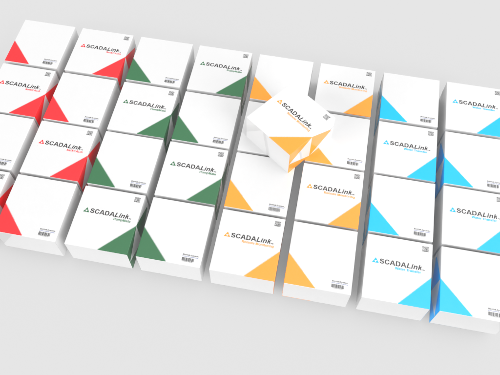
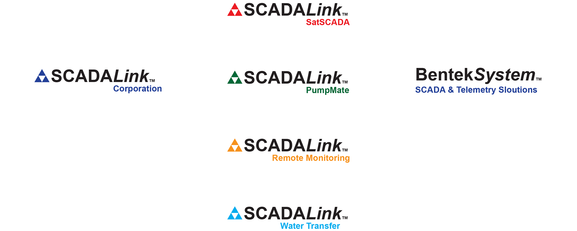
Style A ─ Play with colors
Style A continues with the original triangle symbol and the Arial font style, and adds new colors to identify each product lines/applications, and adding taglines for the product line/application independency. Bentek System will remain as a stand alone product without the triangle symbol.

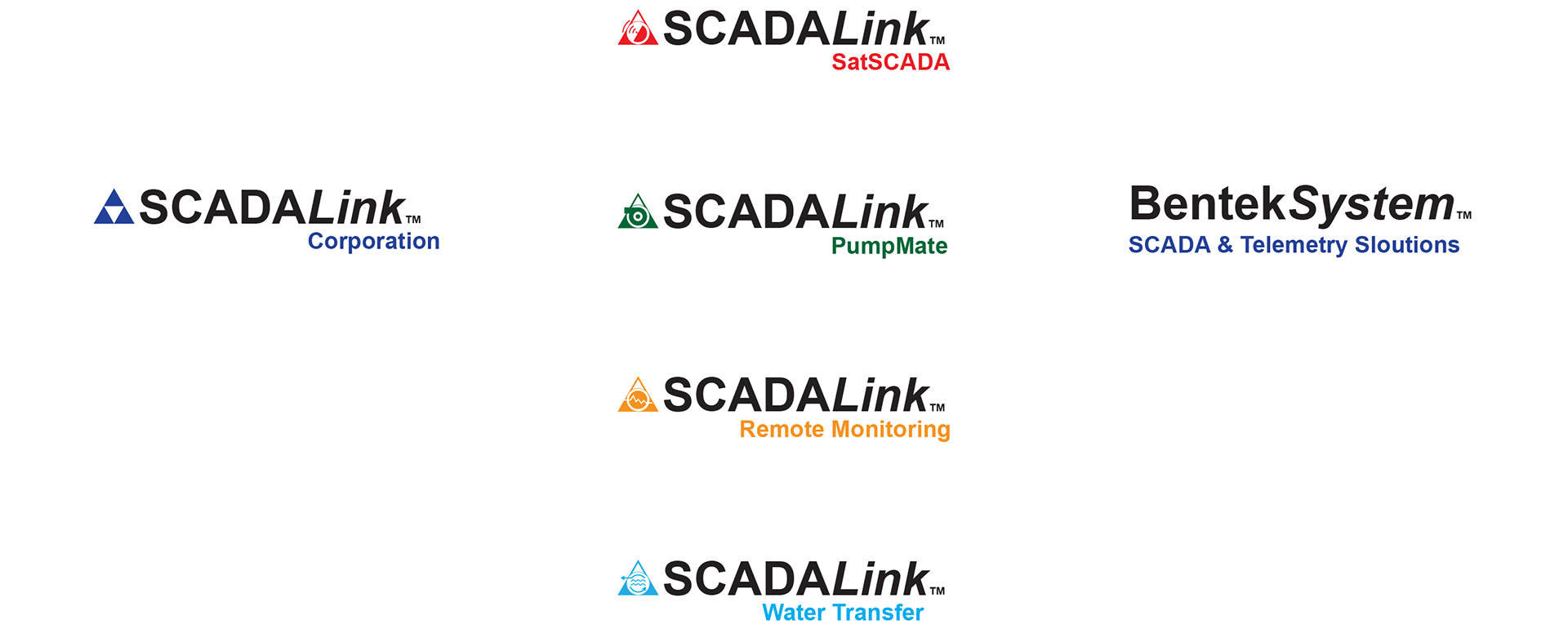
Style B ─ New Symbols
There are four new symbols for the current PumpMate, SatSCADA, Water Transfer and Remote Monitoring applications. The symbols can be used independently for its own product line/application.

Symbol Formula

Satellite Dish + Triangle

Pump symbol + Triangle

Bar graph + Global + Triangle

Transfer arrow + Water wave + Triangle
Pattern Design

Color Theme for Brochure

------- Brochure Design -------

Brochure/Handout sheet


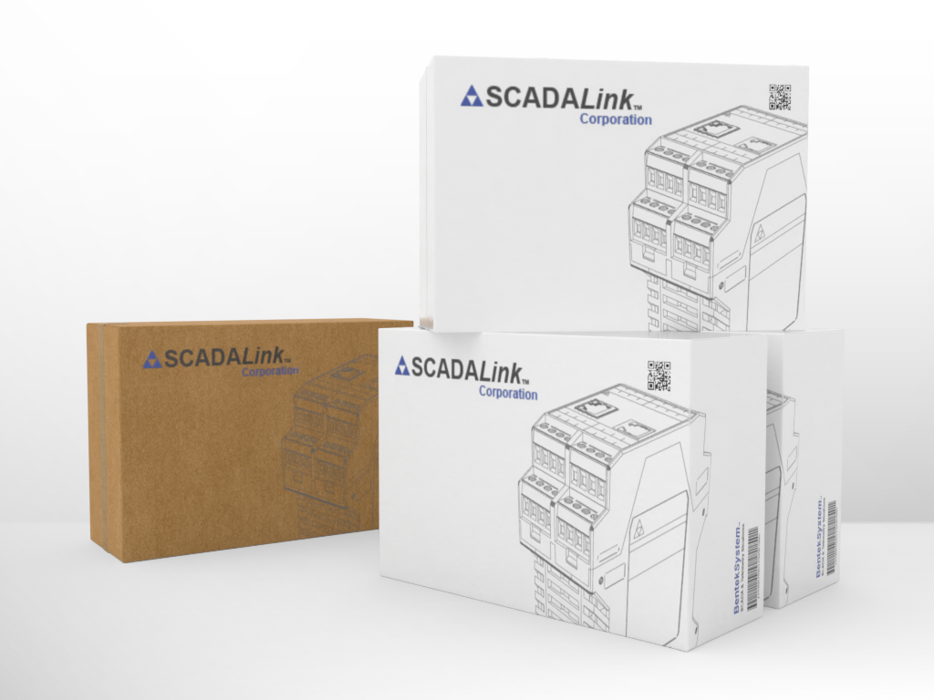
------- Packaging Design -------