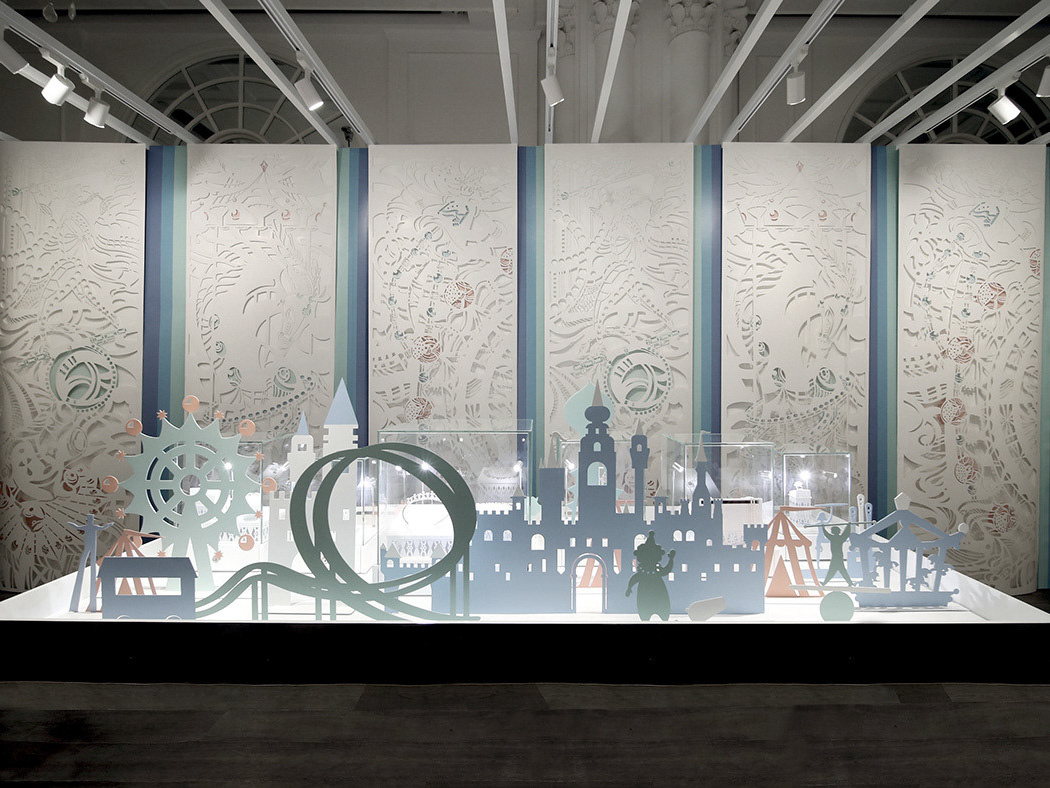
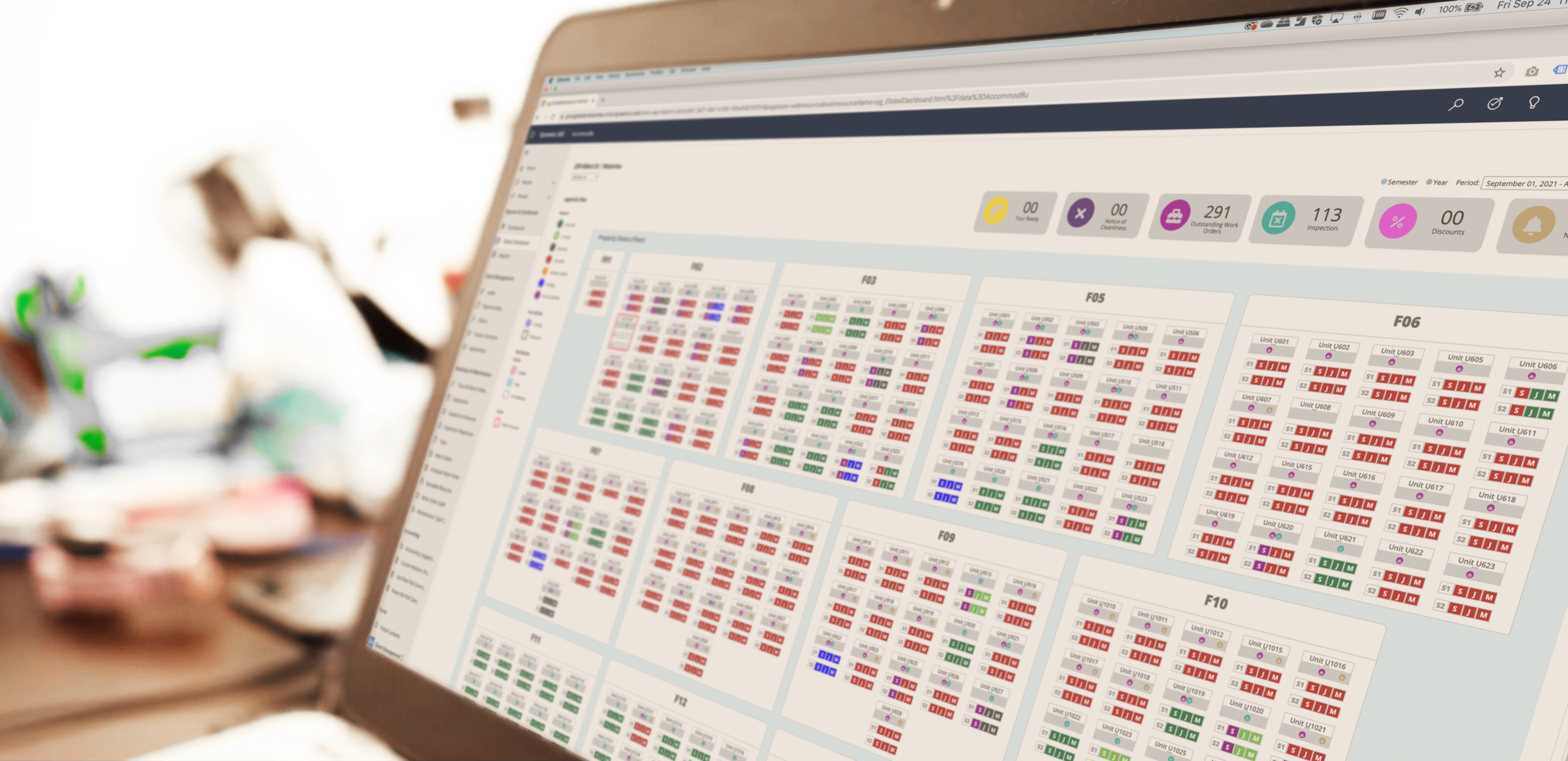
Introducing ACCOMMOD8U Global Dashboard
Sector:
Business, Housing
Business goal:
Increase workflow efficiency
Project timeline:
With six months, ACCOMMOD8U relaunched the new Global Dashboard
Challenge:
There is a high error and tenant complaint rate, as well as increasing overtime labour. ACCOMMOD8U stakeholders wanted to learn why and what could be done.
My role:
As the design's lead, my mission is to design and create a friendly user experience with the booking system to increase workflow efficiency.
Background:
After conducting extensive research on the ACCOMMOD8U booking and maintenance system with key stakeholders, I began a three-month plan to redesign the new Global Dashboard.
Objective:
Increase the number of action items completion and user satisfaction and reduce average task processing time.
— Discovery & Strategy
— User Experience Study
— User Interface Design
— Icon Identity System
— Colour System
— User Experience Study
— User Interface Design
— Icon Identity System
— Colour System
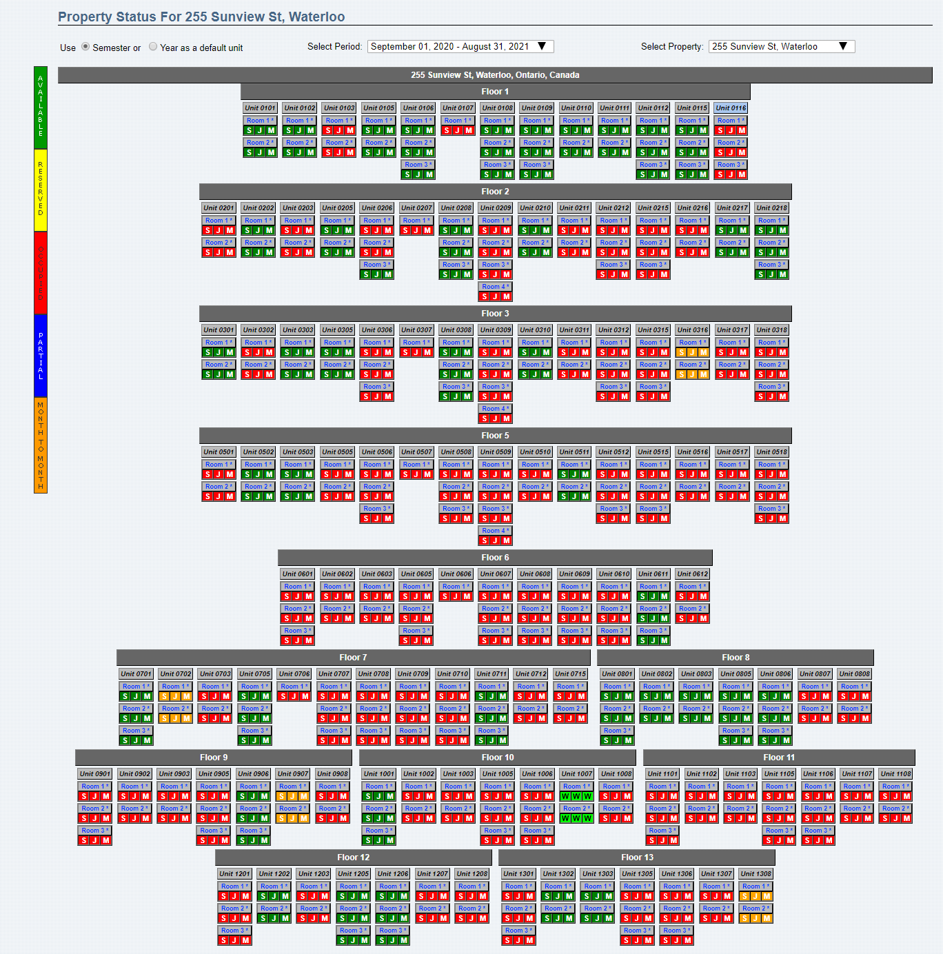
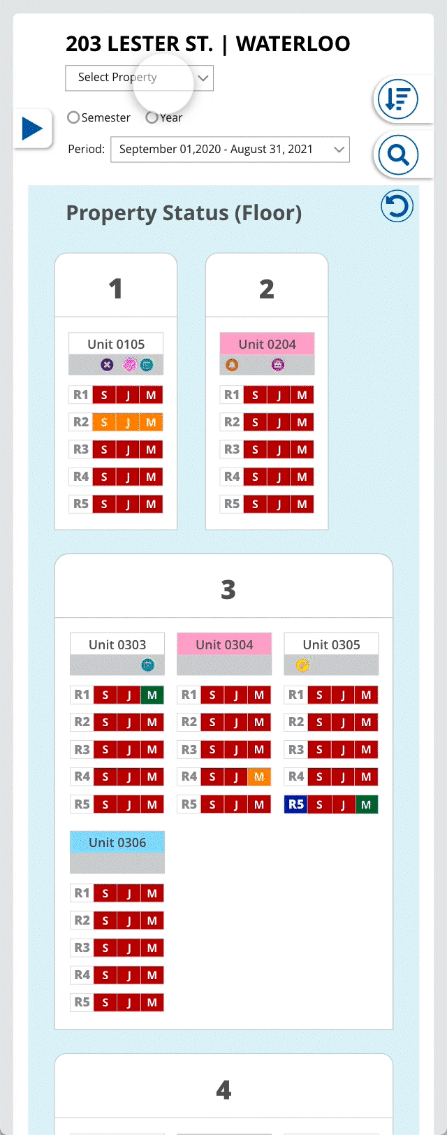
ORIGINAL GLOBAL SYSTEM
SHADOWING
Research:
I shadowed and interviewed leasing agents using the existing system for the first time to understand and learn their pain points. I created bookings in real-time under different situations to be in the shoes of users and observe the booking and maintenance process.
Research finding:
— Frustrated with missing fields on the dashboard
— Confused with misplaced functions in the system
— Overwhelmed by the length of the overall process
— Pressure to find information while dealing with clients
The Opportunity:
I knew an immediate solution would be to relook at the hierarchy and priority of the functionalities, which meant redesigning the dashboard navigation system.
I also noticed the booking process becomes overwhelming when leasing agents are on the phone or interacting with clients and typing the information into the booking system. There is a higher chance of error when losing focus because of the way information was presented.
First Deliverable:
I shared the research findings and opportunities areas to ACCOMMOD8U stakeholders.
Takeaway:
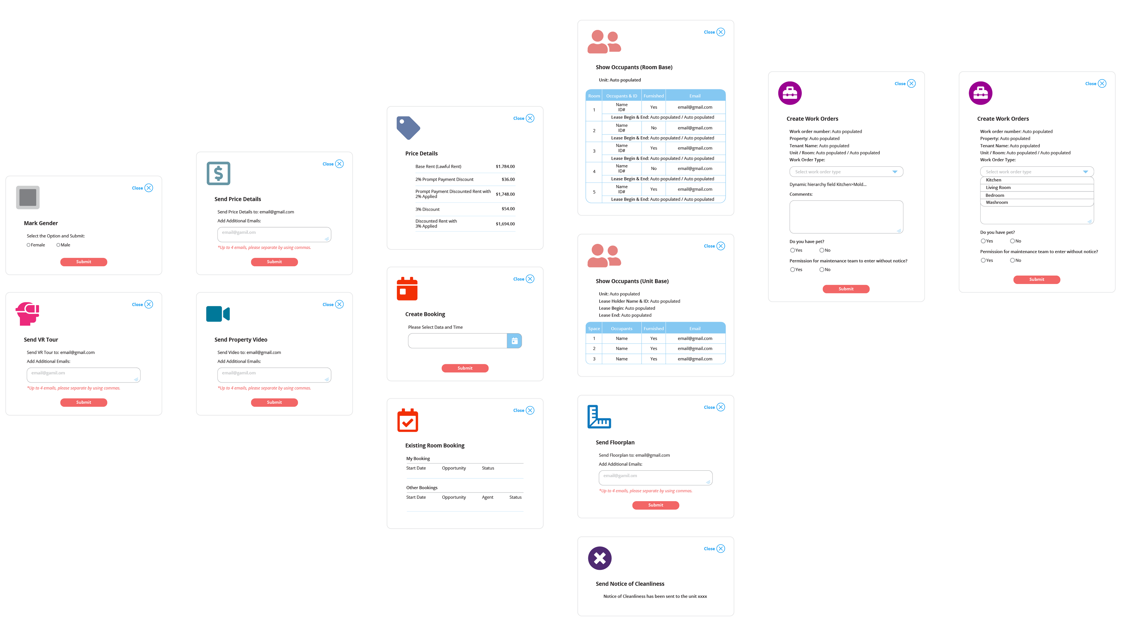
Missing identification for maintenance work completion and notification was a major point of inconvenience. This put a heavy barrier to leasing agents for tours ready and move-in-ready suite availabilities.
The VR suite tour and suite floorplan were not easy to share with clients while the agents were on the phone, which tends to hold a long time with the clients, especially during high volume inquiry hours.
The different offers and discounts on selected properties cause confusion, mainly when additional promotion was applied.
The booking system was not mobile-friendly when agents had suite tours on the site with potential tenants.
Insights from the data:
I parsed ACCOMMOD8U Dynamics 365 - Booking and Maintenance system and Zendesk ticketing system data to find that some of the crucial maintenance and leasing tasks were:
- suite inspection
- outstanding work orders
- tour ready suite
- suite availability
- floorplan sharing to client
- current offers
The redesign process
Card sorting:
I ran a card sorting session that was composed of members from our Leasing and Maintenance teams. I used this technique to determine which dashboard functionalities should stay, be relocated, or be eliminated based on our platform’s information architecture and its added value to our dashboard.
Success criteria:
I knew my redesign needed to answer these key questions:
What would help agents to adopt the new interface system and not add extra stress to their daily workload?
How to coordinate leasing and maintenance information on one global dashboard?
Is the dashboard easy to navigate and find the information?
Prototyping:
Based on our findings shown above, I created a wireframe with new navigation system.
Usability testing and internal feedback:
I created a survey to inquire what should be added or removed from our dashboard. This survey helped to discover potential wins on improvements that could be executed quickly.
The feedback we got back from our client-facing teammates:
Ability to see maintenance info on certain work requests at-a-glance
Enable filter maintenance work requests by units/suites
Iterating:
I decided to use a more universal language to identify the information. Adding a new visual system with Font Awesome icons.
Challenges:
During the redesign process, one of the main challenges is the colour label system. Unfortunately, a different understanding of the colour meanings resulted from users’ cultures, educational backgrounds, and working experience.
In this case, the main goal was to have all the team members agree on the colour system.
We brainstormed to develop all the colours for each information and action item displayed on the dashboard. We also had a workshop with all the teammates and took the feedback to reiterate the final version of the colour system.
Launch:
ACCOMMOD8U stakeholders approved and relaunched the new onboarding in November of 2020 with their new Microsoft Dynamic 365 CRM system.
Results/Impact
The final design has helped increase workflow efficiency by an accessible overview, fewer clicks, and prioritizing visual proximity.
MOBILE


interactive DESKTOP prototype